

Hello. I am Kang Bi-o, an early concept art designer for <Fortress Saga>. In the last article, I introduced the work references and applied design elements. In this article, I will explain the content of the previous article in detail using actual examples from <Fortress Saga>.
'Kubera' Illustration Tutorial
There is a character named 'Kubera' in <Fortress Saga>. Kubera is a Muay Thai fighter with a demigod setting created during the planning stage to target the Thai market. As a Legend-grade character, the illustration is designed to create a strong impression by strongly depicting dust around the character. Now, let's return to the early design stage of Kubera and examine the illustration production process step by step.
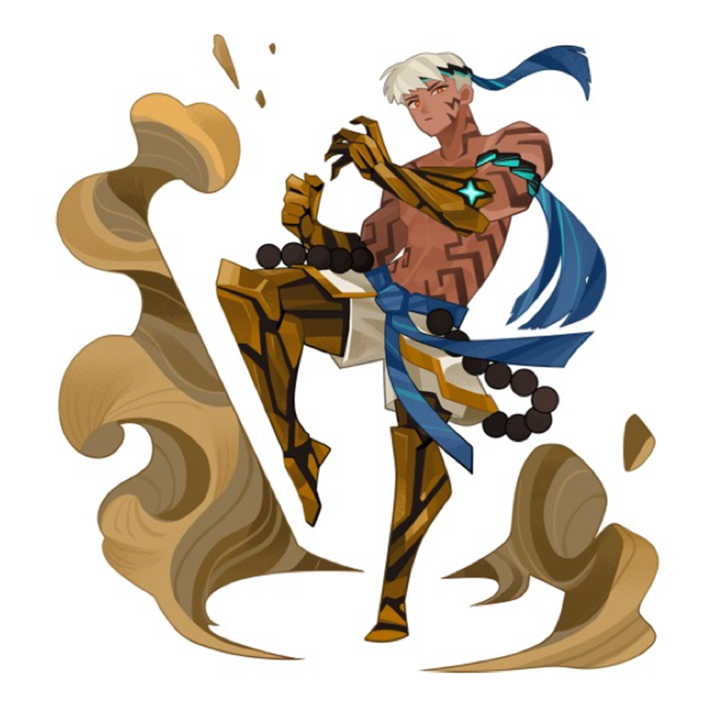
Illustration of Kubera, a Muay Thai fighter
Collecting data
The most fundamental aspect of original artwork is data collection. It is no exaggeration to say that simply finding the right materials is practically half the work done. I collected materials focusing on Kubera's basic concept: a "Thai Muay Thai fighter." At the time, there were no new male characters in <Fortress Saga>. So, the planner at the time requested that I make the first male character handsome, and in response to that request, Kubera's facial work was carried out with an aesthetic concept.
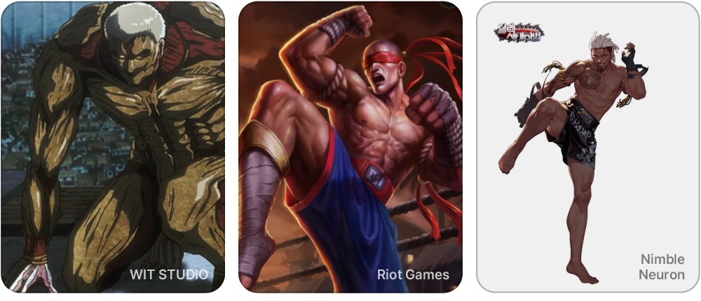
Initial references collected through discussions with planners and POs
1. Rough sketch


Once data collection is sufficiently complete, the next step is rough sketching. In the case of Kubera, during the sketching stage, I prioritized movements and attire suitable for the Muay Thai profession. Since the character's class, rank, and personality must be naturally discernible just by looking at their clothing, weapons, and movements, I paid particular attention to ensuring these elements harmonized.
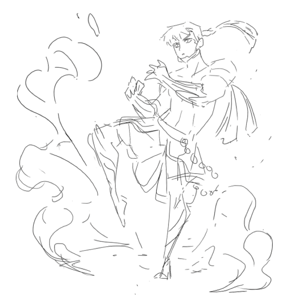
Step 1: Rough Sketch
2. Rough coloring
The next step is coloring. Since using only two colors can make a character look monotonous, it is best to first determine the primary and secondary colors, and then add a tertiary color that contrasts with yet harmonizes with these two. In the case of Kubera, gold and black are the main colors, and blue was added as an accent color to refine the overall impression. I tend to finish the rough coloring stage relatively quickly.
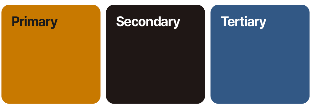
Kubera's main color and sub color
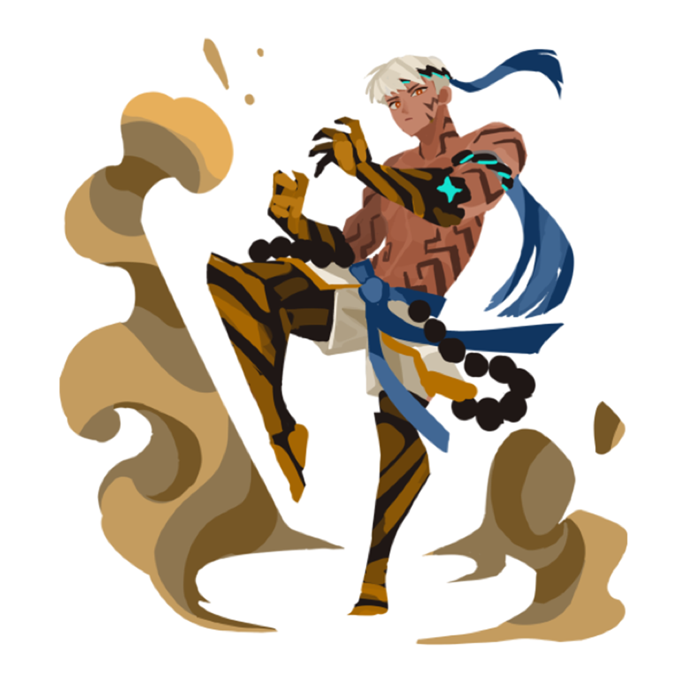
Step 2: Rough Coloring
3. Line Cleanup
Now it is time for the line cleanup stage. This is the step where we clean up the lines using the vector line function of Clip Studio, which I mentioned in Part 1. When working on <Fortress Saga>, I marked the outlines in thick red and the interior in thin blue to make the character clearly legible. Also, to maintain a flat atmosphere, I did not trace every single overly detailed line, but kept lines only where necessary to maintain a concise form.
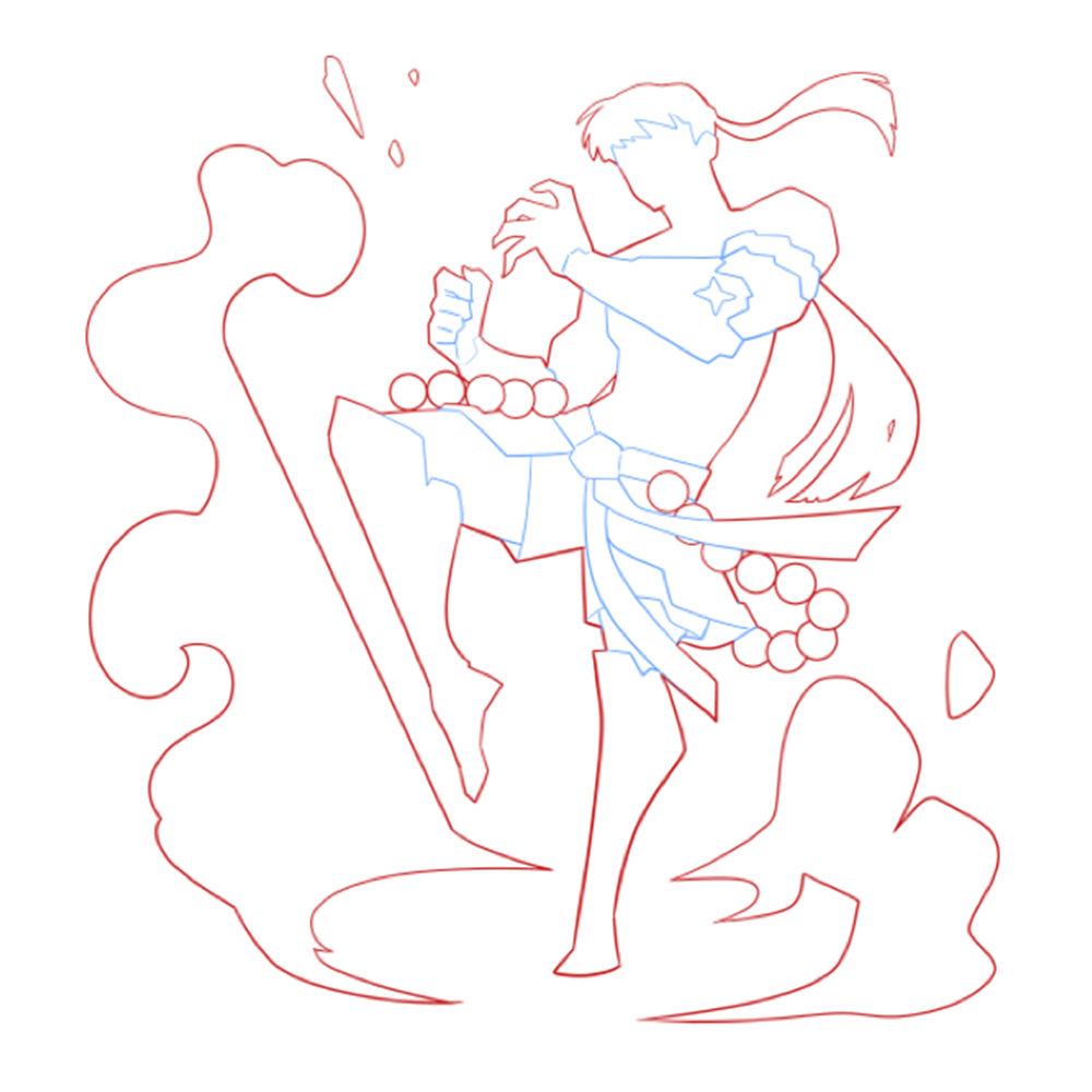
Step 3: Line Cleanup via Clip Studio
4. Fill in the base color
Once the line cleanup is complete, use Clip Studio's base fill function to fill in the color according to the silhouette shape. This feature automatically fills in the color when you select the line area with a lasso tool, and defining the areas in advance like this makes the subsequent coloring process much easier. Those who have worked on original artwork will likely be familiar with this method.
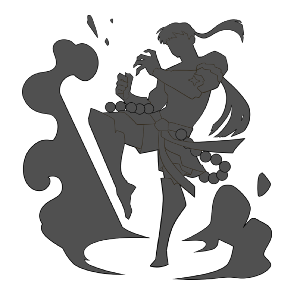
Step 4: Filling in the base color using Clip Studio
5. Detail Coloring
Now, import the working file into Photoshop and fill in the base colors according to the standards set during the rough coloring stage. Thanks to having filled in the silhouette beforehand, you can lock the layer's alpha channel to prevent color bleeding and paint comfortably.
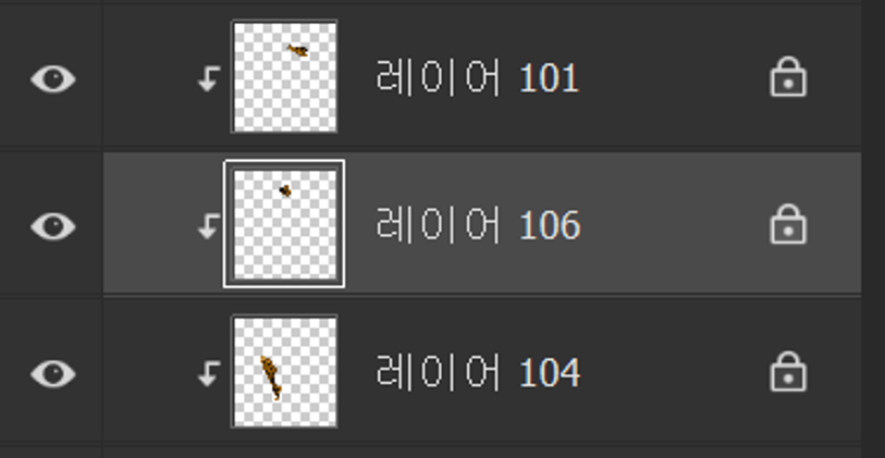
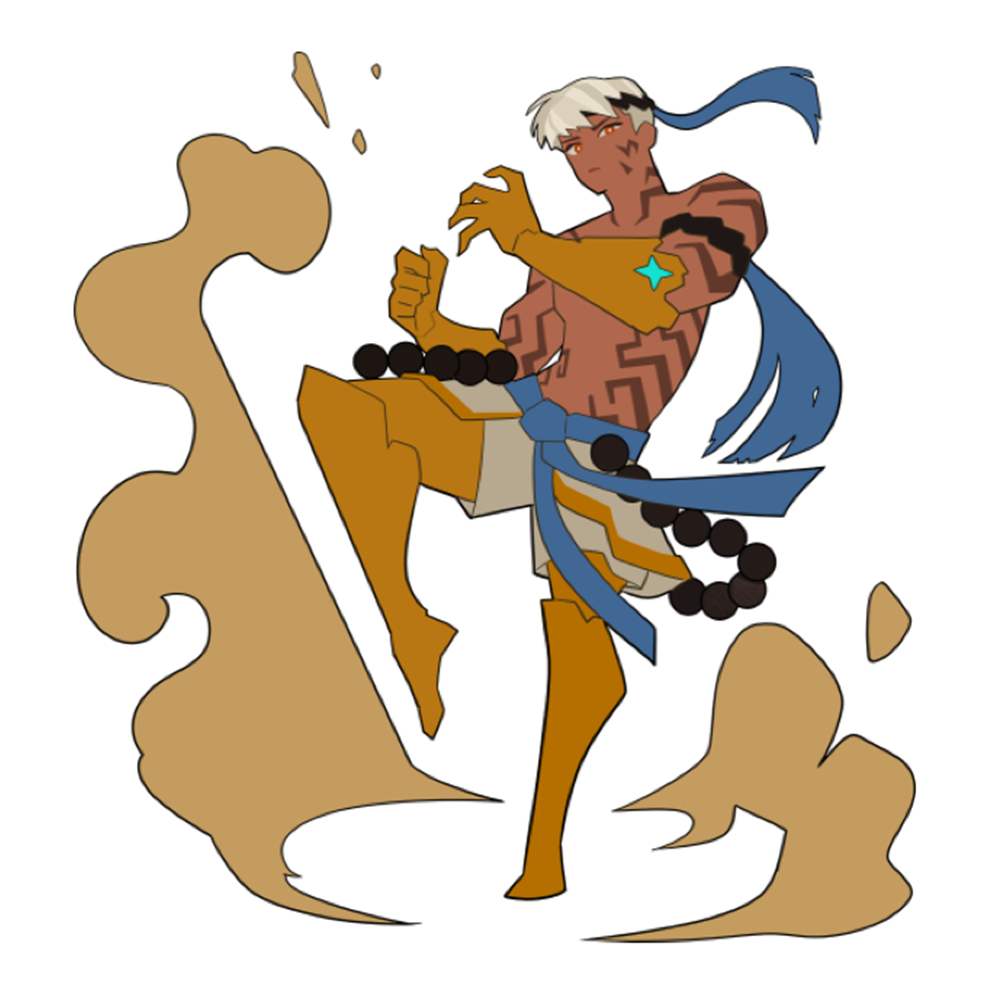
Step 5: Detail Coloring via Photoshop
6. Adding shading
Next, we add detail through shading. At this stage, it is most important to maintain the flat rendering style mentioned earlier. Rather than creating a sense of three-dimensionality with rounded lines, we apply shading with sharp, angular surfaces to maintain a flat style. I primarily use a flat brush and color while adjusting transparency using the number keys. Even if a rounded shape is absolutely necessary in a certain area, I do not use gradients; instead, I complement the natural feel through the texture work in the next step.
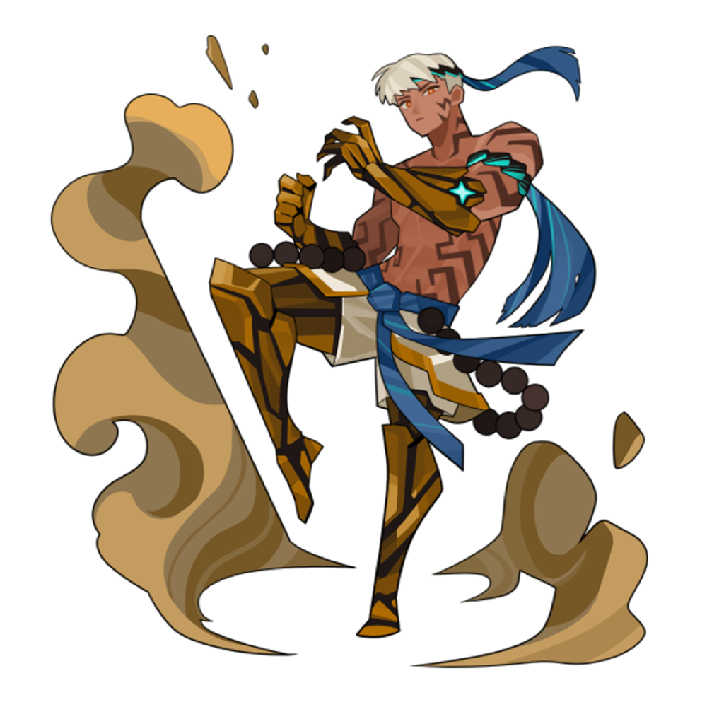
Step 6: Drawing Light and Shadow and Detail
7. Outline Coloring
After adding shading, proceed to color the outlines. Paint the lines using a color that is slightly darker than the adjacent surfaces and has an appropriate saturation. During this process, it is important to strike a balance so that the outline color does not become too dark and stand out too much on the screen.
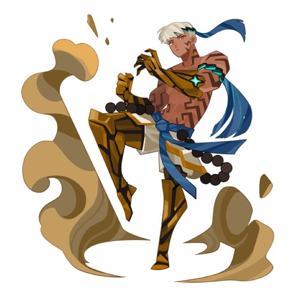
Step 7: Outline Coloring
Coloring outlines can be quite cumbersome. However, if the image is borderless, there is a much simpler way to create colored lines. By utilizing Photoshop's 'Minimum' and 'Maximum' filters, you can automatically generate outlines while preserving the layer's color. Using this feature eliminates the need to manually color in lines one by one, significantly reducing your work time.
How to easily create outlines using Photoshop
8. Inserting Textures
In the final stage, I work on textures. Rather than using gradients directly, I prefer using wide texture brushes to create natural variations in shading. For expressing materials like fur or metal, I use a touchline brush to add detail and prevent a flat appearance. For areas that are difficult to express with brushes alone, I supplement them by drawing directly by hand. For example, I completed the delicate lines used in the effects around Kubera by drawing them all myself.
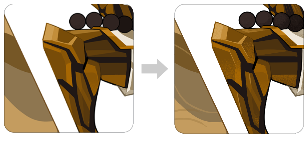
Step 8: Before/After Texture Insertion
completion!
Although Kubera was a task that did not require much separate correction, there are times when the finished image looks strangely dull or excessively sharp. In such cases, you can finish by adjusting the hue or level values to refine the tones.
Kubera illustration completed through eight stages
In conclusion
To summarize, the art style of <Fortress Saga> started with the goal of minimizing dislikes by appropriately blending characteristics of Eastern and Western painting styles. While my personal taste is also reflected to some extent, the core objective was to create a balanced style that anyone could comfortably accept. Whether it is subtle or vibrant patterns, finding the right textures for the painting and arranging them appropriately can create a sufficiently rich impression even within a cell-shaded style. I hope my story serves as a small inspiration for your work as well.
This text is a reproduction of the original article from CookApps Story. View Original