
Hello. I am Kang Bi-o, an early concept art designer for <Fortress Saga>. In this article, I would like to share the behind-the-scenes story of <Fortress Saga>, spanning from its initial launch to its operation, as well as concept art production tips and illustration tutorials that I have accumulated while working, along with examples.
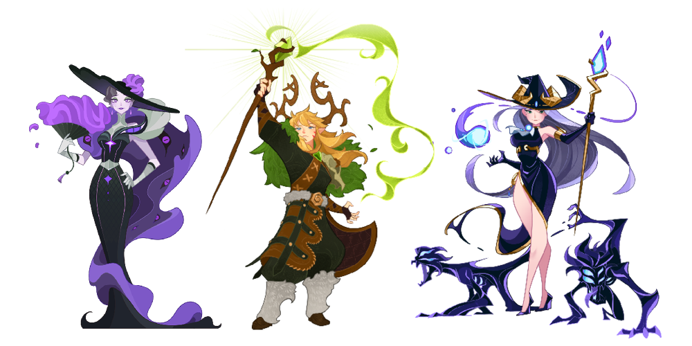
Characters from Fortress Saga that I created myself
First, in Part 1, I will discuss why <Fortress Saga> chose this style, what references were consulted, and what principles were established to increase work efficiency. In the following Part 2, I plan to share in detail the actual production process of completing a single illustration and the practical know-how gained along the way.
1. Why did it become this style?
Let's avoid the dislike rather than the extreme like!
The initial art direction for the launch started with a single sentence: “Let Fortress Saga avoid dislike rather than extreme like.” Going for a Western style would feel unfamiliar to Eastern users, while going for a Japanese style would create resistance in the West. Therefore, we had to find a middle ground between the two styles without leaning toward one side. That point of balance was precisely the art style of <AFK Arena>. <AFK Arena> featured cell-based art where coloring follows lines, a style where Western textures and Eastern delicacy coexisted. Our primary goal was to bring that feeling while working in a more concise and efficient manner.
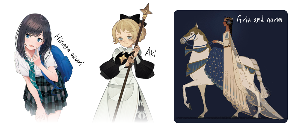
A reference that leans neither towards the West nor the East, <AFK Arena>
You cannot spend an infinite amount of time working on game concept art. While painterly depictions with vivid brushstrokes like the one by Vanillaware below are certainly beautiful, they take a fatally long time for the LD production schedule. On the other hand, BattleHand's simple flat style risks making the overall mood feel too light. Therefore, we decided to find a middle ground—a balance between three-dimensionality and flatness. Rich yet fast depiction, yet simple. We established the style based on that exquisite 'middle ground'.
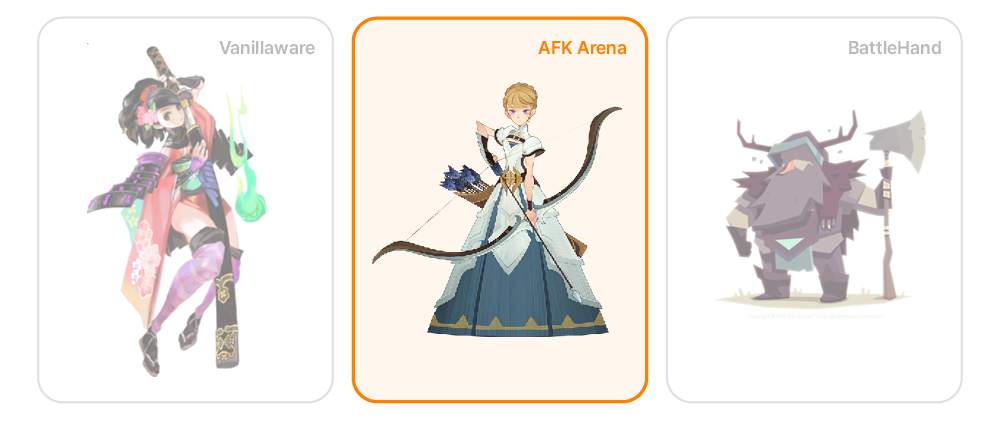
The balance found between detail and flatness
References consulted
As mentioned earlier, in addition to the <AFK Arena> style, we consulted various references to bring out the unique atmosphere of the Western. We worked on the LDs and illustrations by referencing everything from the curved decorations found in Alphonse Mucha's Art Nouveau style to the expressive style of <AFK Arena> original artist Kuri Huang.
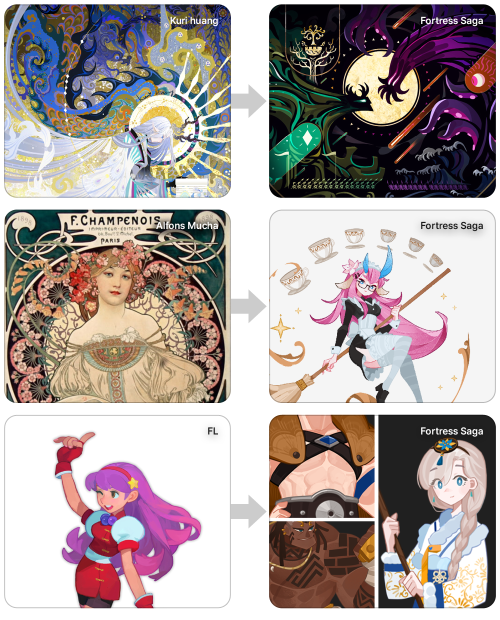
References consulted and illustrations and LDs from <Fortress Saga>
Furthermore, the movement and form are clearly expressed based on the Disney-style figure deformation often seen in Western artwork. The advantage of Disney-style figure deformation is that by reducing fine details and prioritizing flow, the viewer's gaze is not interrupted, allowing it to be read naturally as a single silhouette.
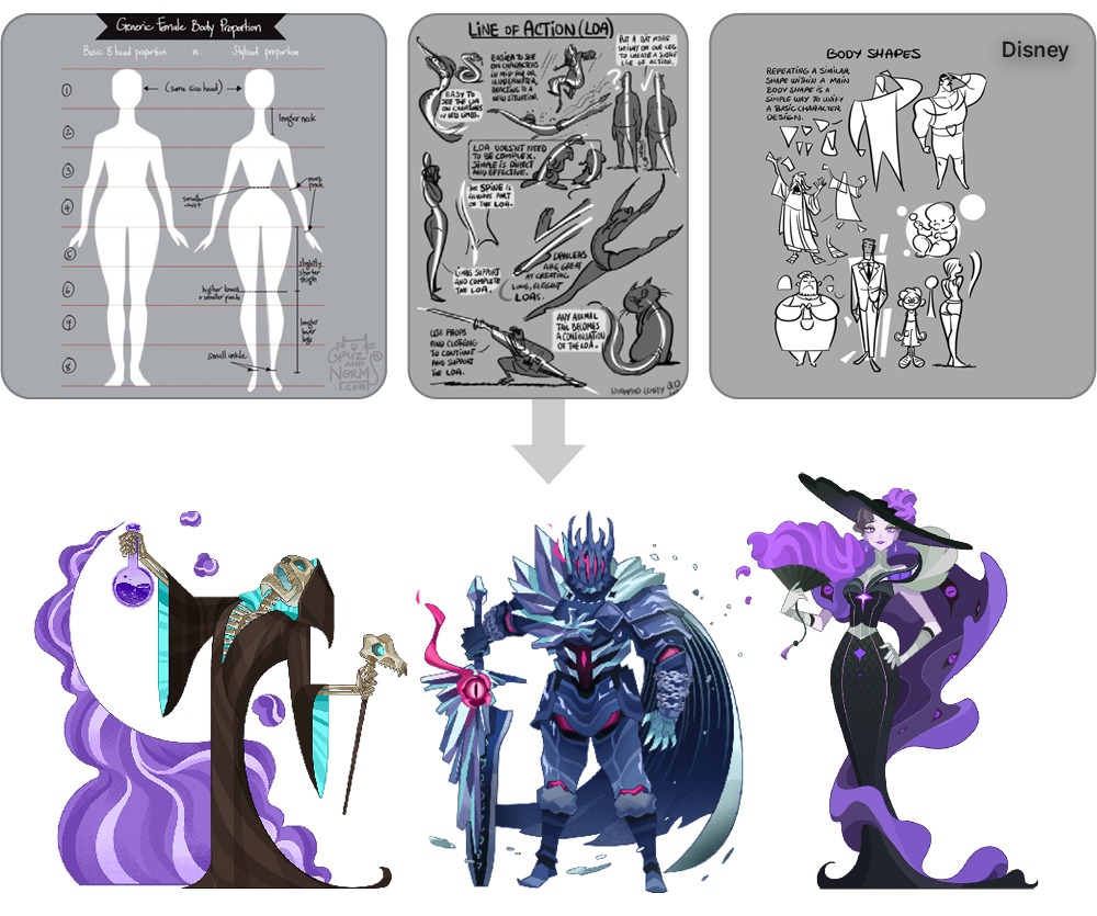
Disney-style human figure deformation applied to <Fortress Saga>
I also aimed for a flat style that minimizes the depiction of mass. I avoided styles with a lot of detail, like the art of <Nikke>, because they place a heavy burden on the work speed.
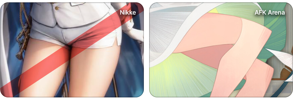
Flat art style of <AFK Arena>
2. Factors considered for work speed
We intended to reference the style of <AFK Arena>, but <AFK Arena> is characterized by its elaborate layering of textures resulting in a splendid and fluid depiction. Since applying this approach would be time-consuming, a more efficient approach was required for <Fortress Saga>.
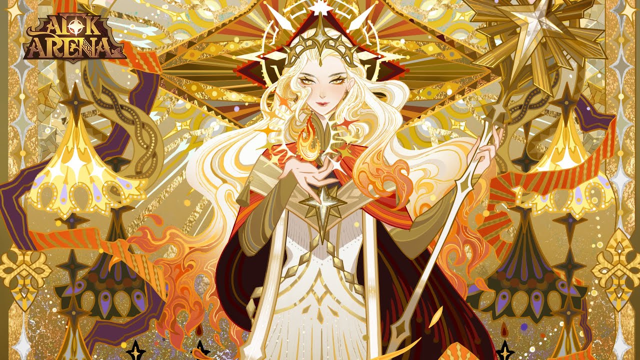
<AFK Arena> with intricately layered textures
Reduce work time with Photoshop
First of all, since the illustration in Fortress Saga is cell-based, line work is fundamentally required. You can save a significant amount of time by utilizing the line correction function of Photoshop brushes to smooth out the lines. It might feel inconvenient at first, but if you boldly increase the correction values, you can noticeably shorten your work time, even if it hurts your pride a little. I think I saved about 30% of my time using this feature.
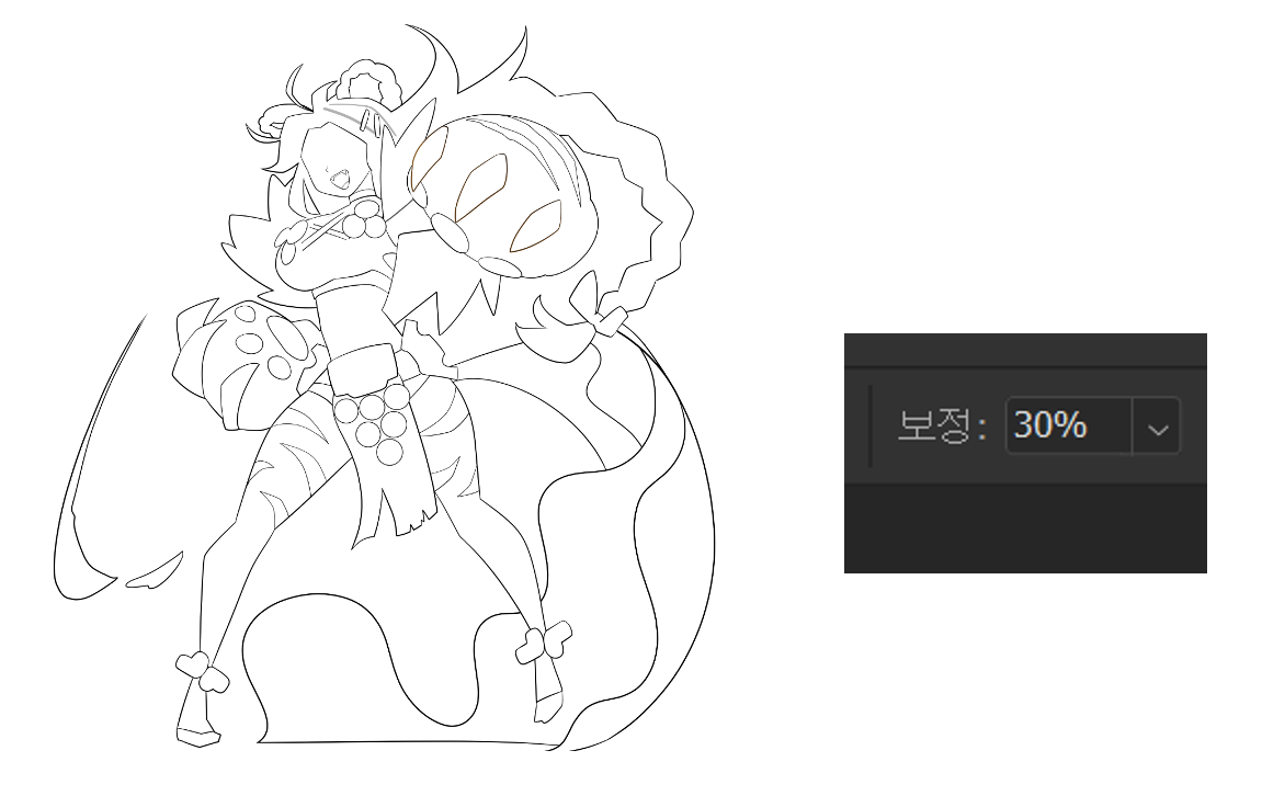
Photoshop line correction feature that saves time
Using Vector Lines in Clip Studio
I used a program called Clip Studio for the line work. Using Clip Studio's vector line feature aligns protruding lines to endpoints, allowing you to clean up much faster without having to erase unnecessary lines.
Cleaning up outlines using vector lines
Finally, after completing the coloring, changing the black outlines to colored outlines can maximize the character's flat feel and enhance the overall finish.
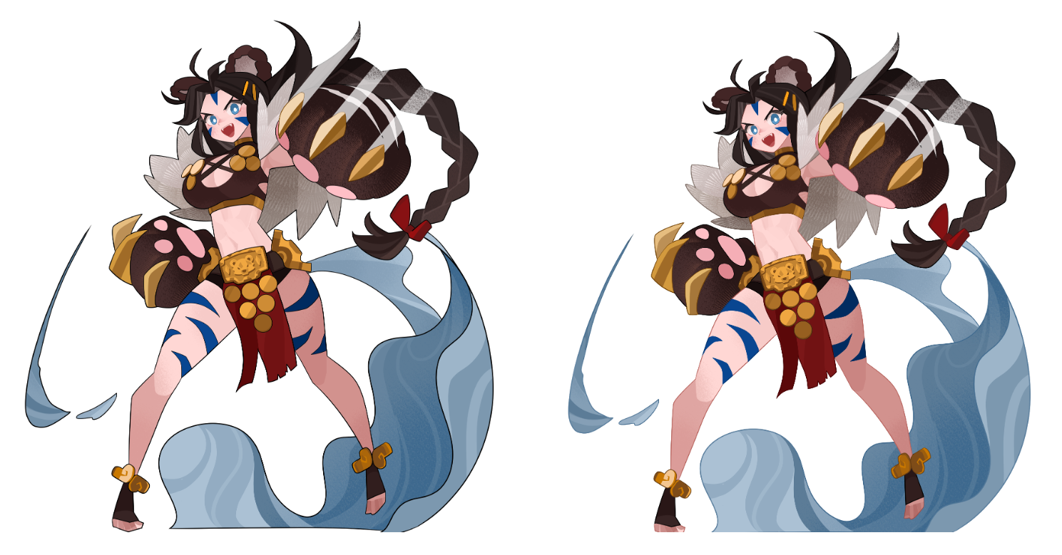
Before and after adding color to the outline
The story continues in Part 2.
This text is a reproduction of the original article from CookApps Story. View Original